Sometimes (but not very often) words fail me.
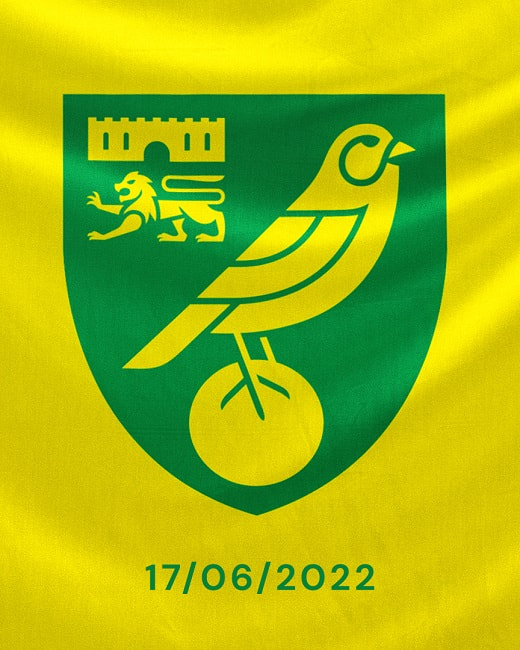
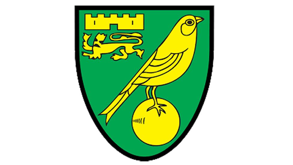
I have just seen the new Norwich City crest which will be adopted in June 2022.
Apparently the club has been working with design agency SomeOne to come up with a new crest which looks spookily like the previous one from 50 years ago. Admittedly the castle is slightly different as is the Canary standing on a football and the Lion looks more like well a Lion but I wonder how long it took to come up with this new design and more importantly how much did it cost? I reckon a decent artist could have knocked it up in half an hour, but what do I know?
Have a look at the two designs and it really is a case of spot the difference.
The commercial director had the following to say about the new crest:
"This is a huge moment in the history of Norwich City and a real statement of intent for the future. For the first time in 50 years the club will adopt a newly evolved crest, fit for digital purpose, iconic and most importantly accessible for all"
I think when City got various promotions, when they played in Europe and when they won what was the Milk Cup those were huge moments in the history of Norwich City and not when they got a slightly modified crest which has little or no bearing on what goes on on the field of play.
I feel this is so typical of so much that goes on today. We all too often lose sight of the raison d'etre for something as we become bogged down with frippery without attacking the core points. What the club crest looks like will have no bearing on important things like winning football matches for instance.
Still I'm sure come next year the commercial director will probably inform us that the reason Norwich have won five games in a row is the new club badge. Or if we lose five in a row he can say "never mind we have an historic new club crest which is much more important." What a load of old tut.
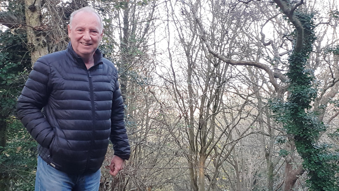
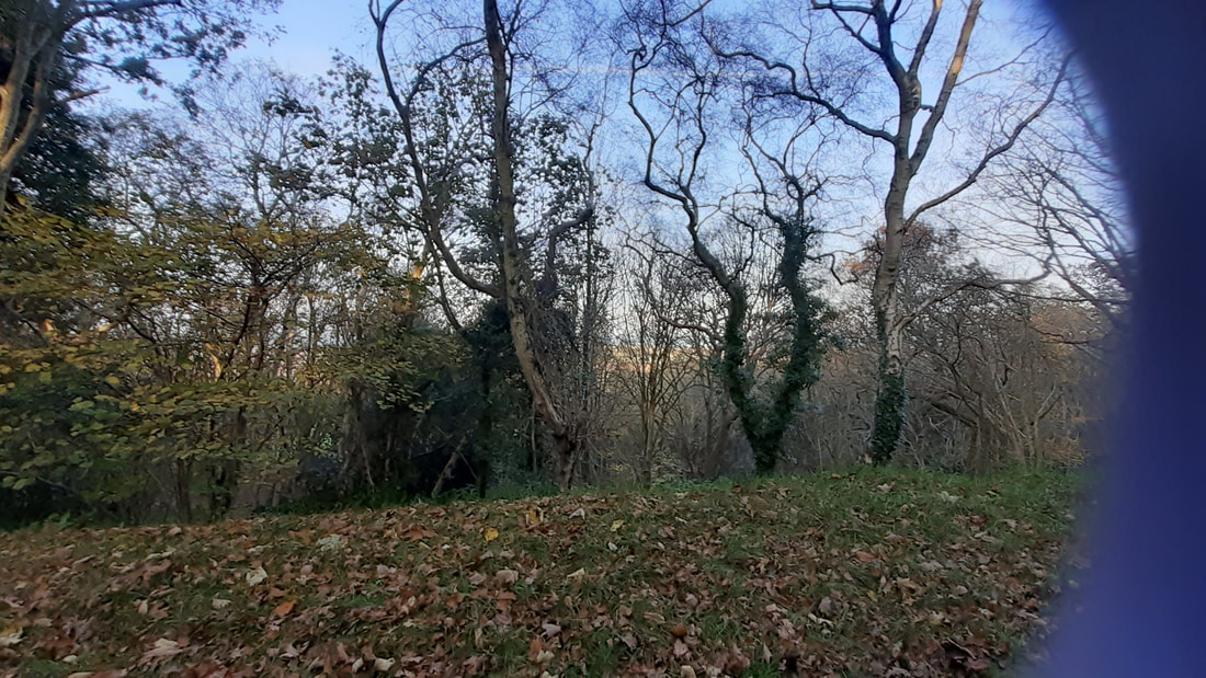
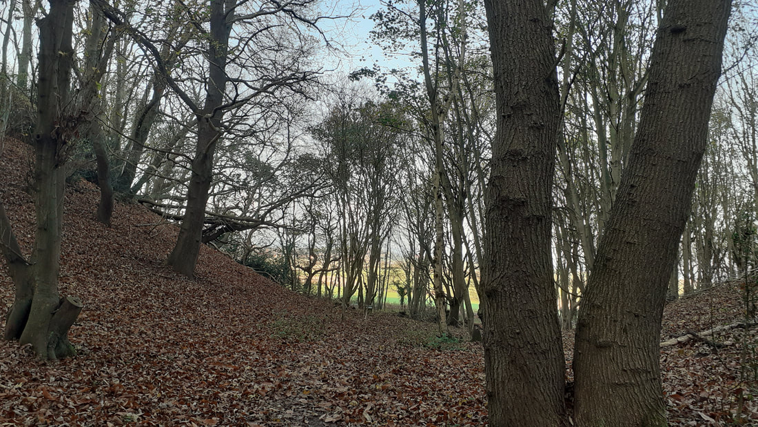
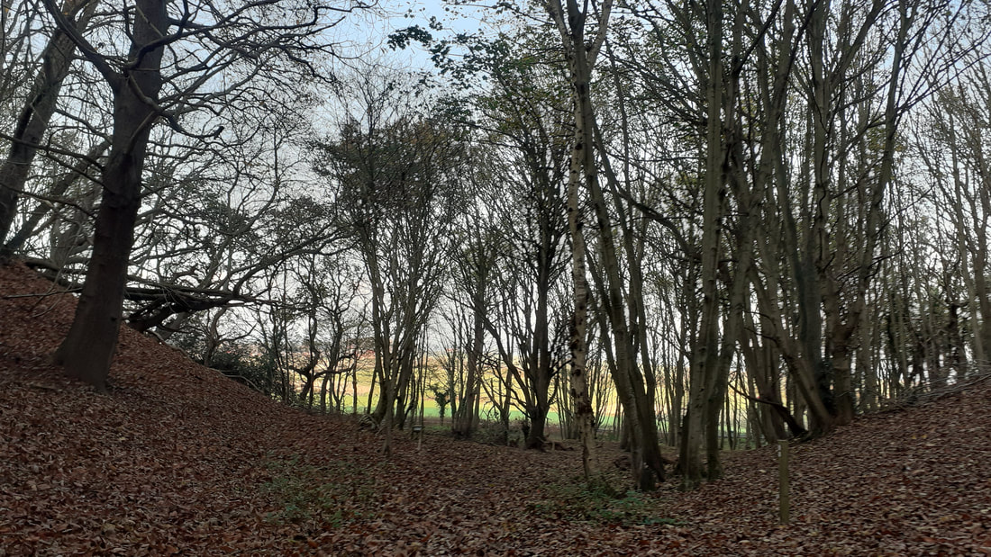
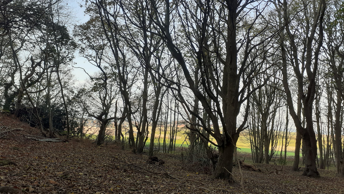
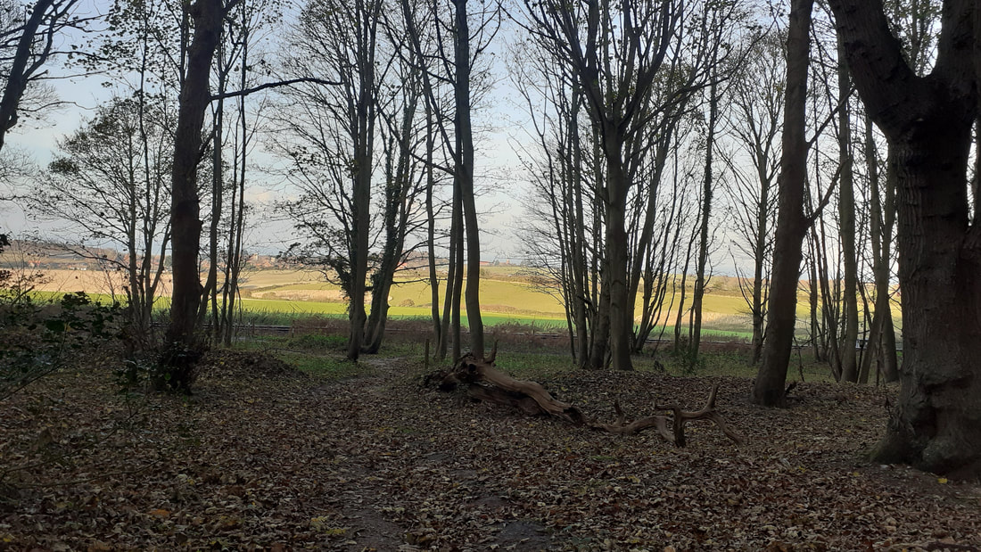
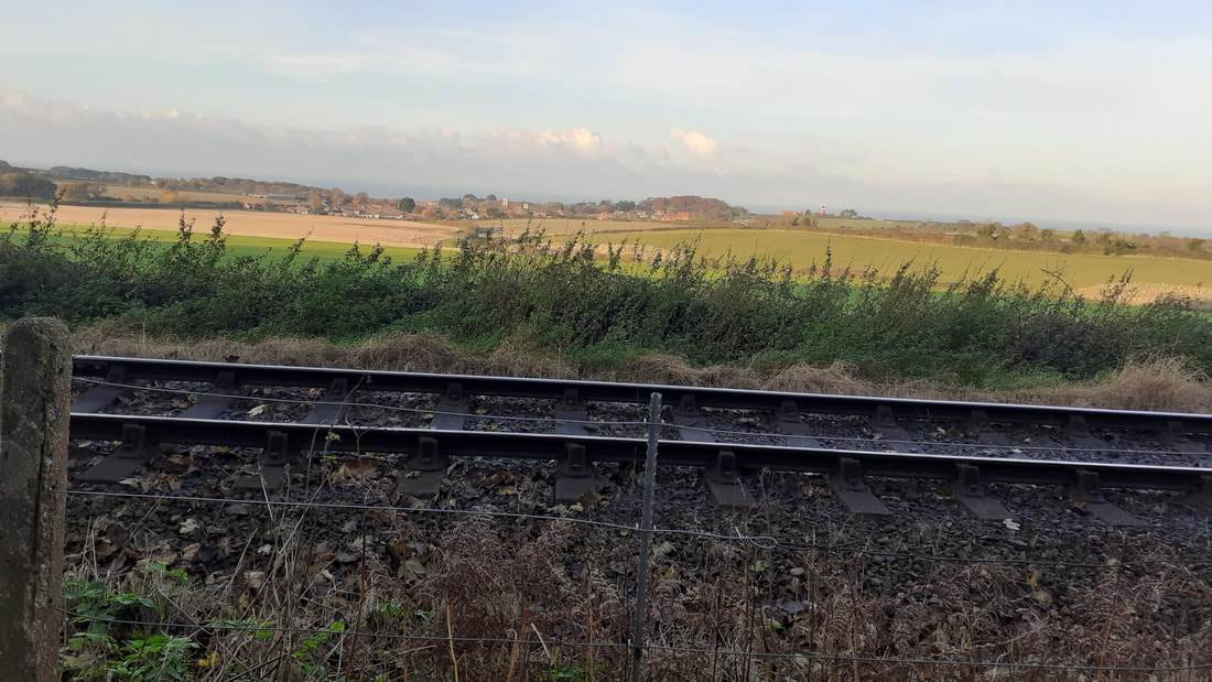
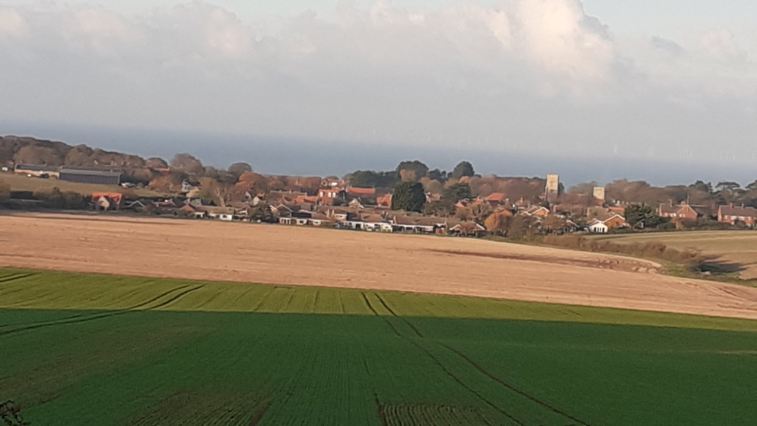
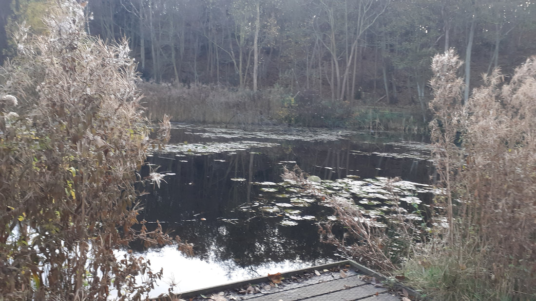
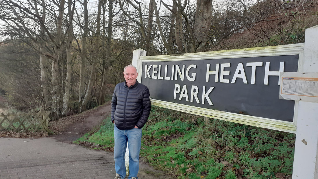
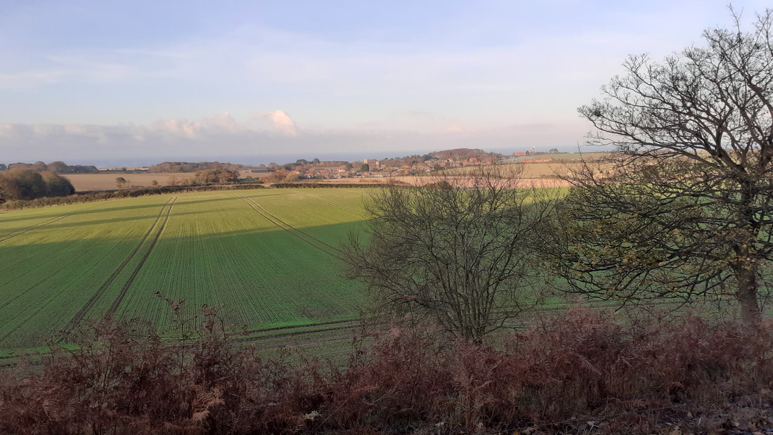
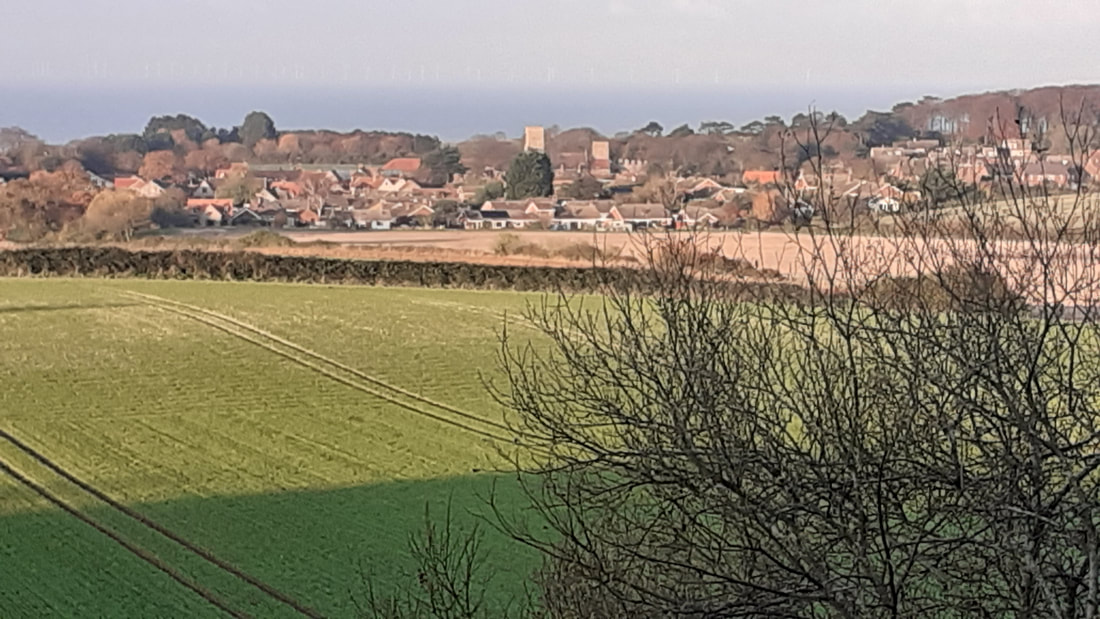
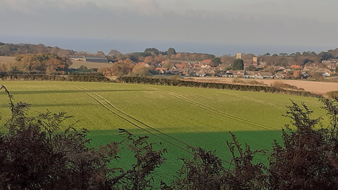
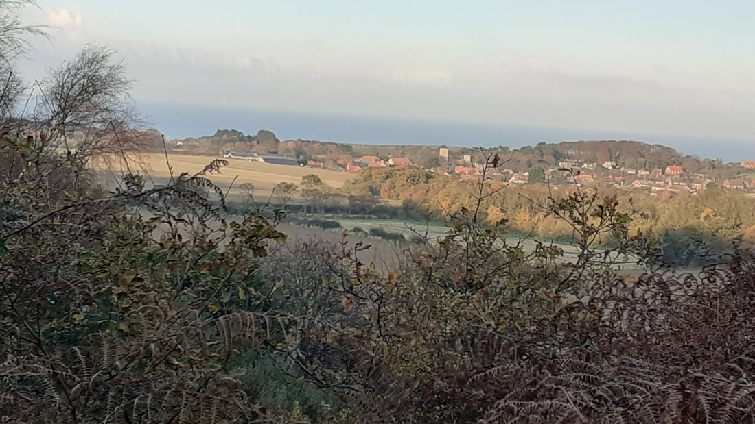
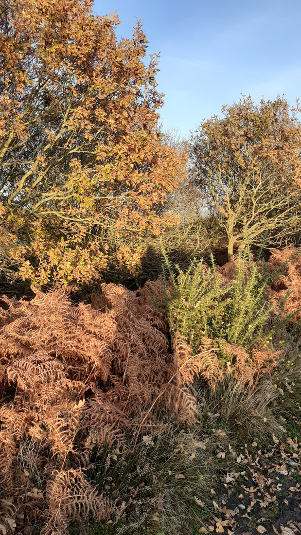
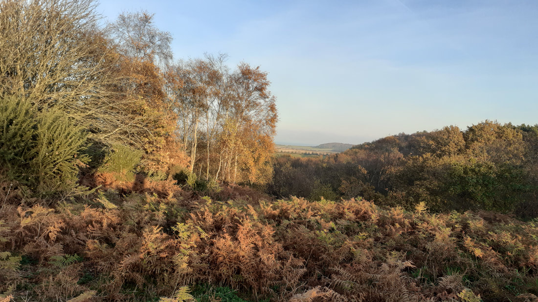
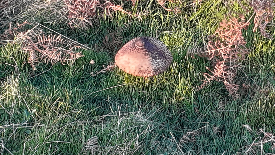
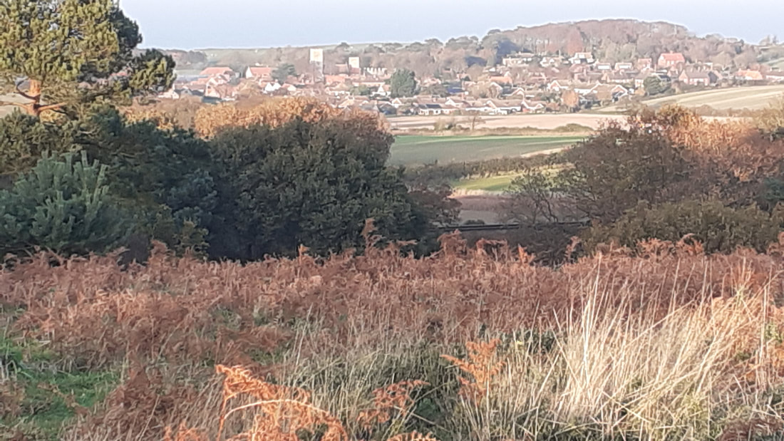
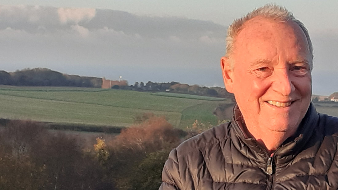
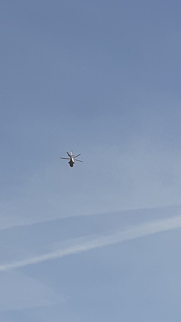
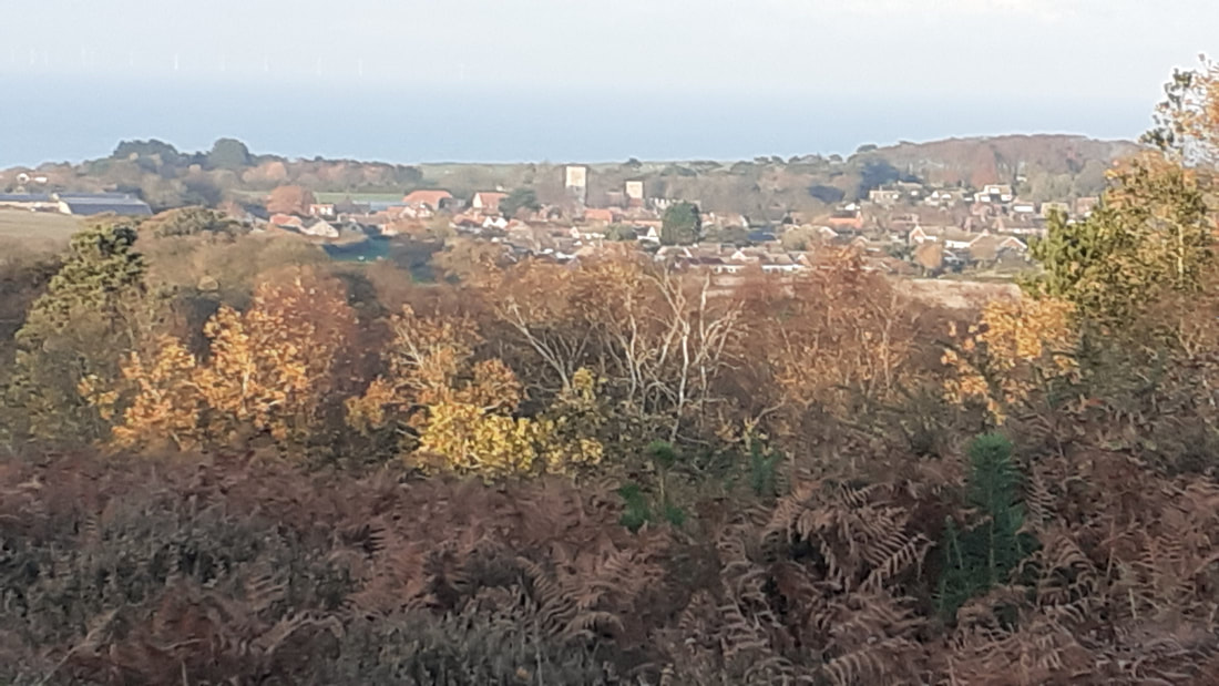
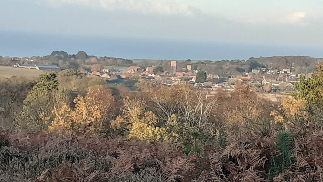
In addition to the pictures of the old and new crest (the old one has a black edge), there are a few of North Norfolk which I hope you enjoy. They are mainly forest photos, although I do appear in far too many.
I have just seen the new Norwich City crest which will be adopted in June 2022.
Apparently the club has been working with design agency SomeOne to come up with a new crest which looks spookily like the previous one from 50 years ago. Admittedly the castle is slightly different as is the Canary standing on a football and the Lion looks more like well a Lion but I wonder how long it took to come up with this new design and more importantly how much did it cost? I reckon a decent artist could have knocked it up in half an hour, but what do I know?
Have a look at the two designs and it really is a case of spot the difference.
The commercial director had the following to say about the new crest:
"This is a huge moment in the history of Norwich City and a real statement of intent for the future. For the first time in 50 years the club will adopt a newly evolved crest, fit for digital purpose, iconic and most importantly accessible for all"
I think when City got various promotions, when they played in Europe and when they won what was the Milk Cup those were huge moments in the history of Norwich City and not when they got a slightly modified crest which has little or no bearing on what goes on on the field of play.
I feel this is so typical of so much that goes on today. We all too often lose sight of the raison d'etre for something as we become bogged down with frippery without attacking the core points. What the club crest looks like will have no bearing on important things like winning football matches for instance.
Still I'm sure come next year the commercial director will probably inform us that the reason Norwich have won five games in a row is the new club badge. Or if we lose five in a row he can say "never mind we have an historic new club crest which is much more important." What a load of old tut.
In addition to the pictures of the old and new crest (the old one has a black edge), there are a few of North Norfolk which I hope you enjoy. They are mainly forest photos, although I do appear in far too many.
 RSS Feed
